
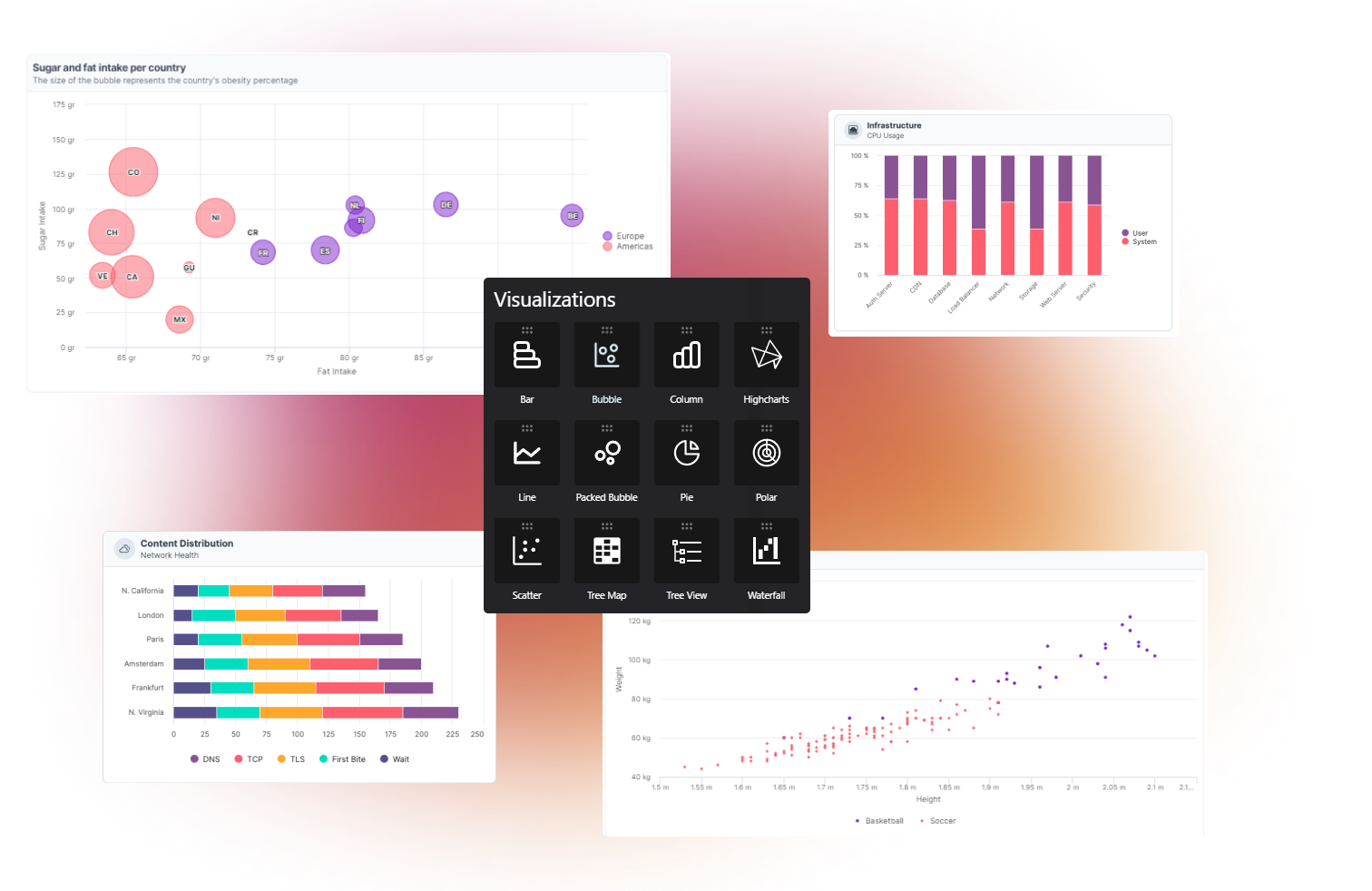
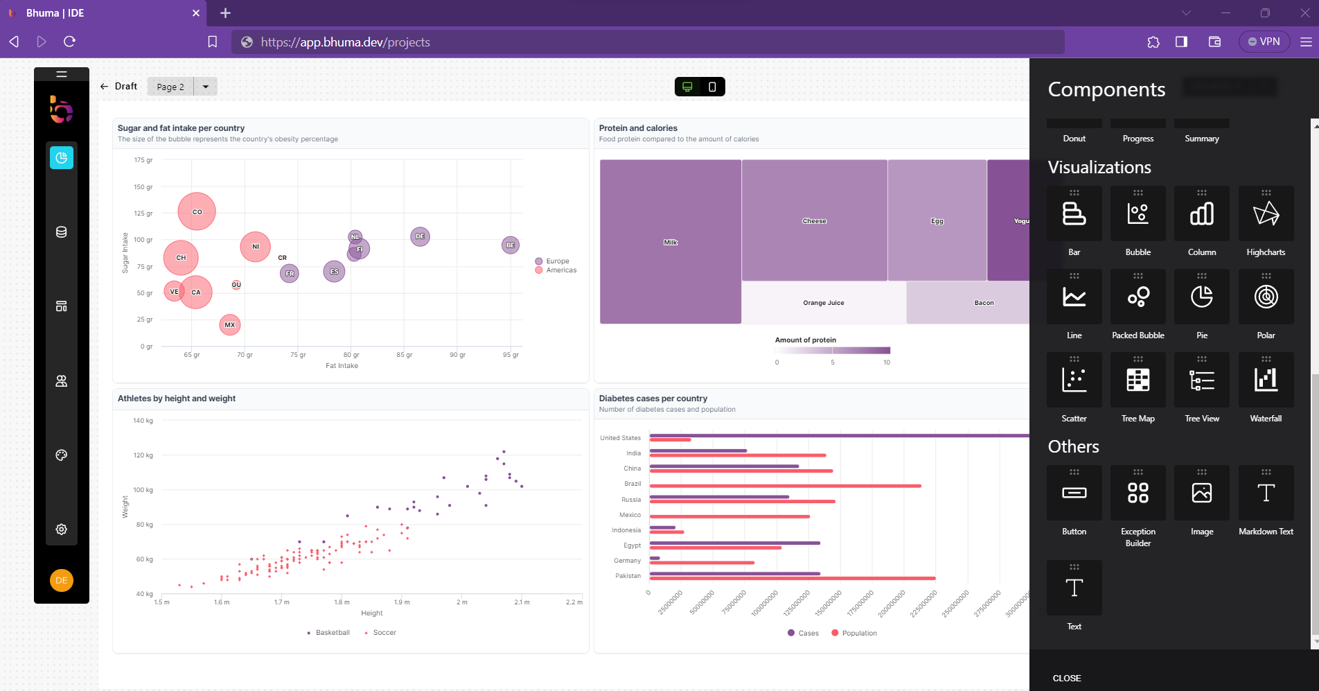
Visualizations
In the world of data analysis, data visualization is a game-changer. It transforms complex data into visual forms like charts and graphs, making information more accessible and meaningful. This powerful tool helps uncover hidden patterns and insights in large datasets.
Whether you're a data analyst, business pro, or just love data-driven decisions, visualization lets you explore and share information in a compelling way.
Our elements make creating and modifying applications a breeze, so you can focus on functionality instead of spending hours on coding individual components. Ready-to-use visualizations ensure a smooth ride for your app!
Dimensions for visualizations
Two- and three-dimensional visualizations are essential in data analysis and presentation because they can provide a more intuitive and immersive way to explore and understand complex data sets.
Two-dimensional visualizations, such as scatter plots, line graphs, and bar charts, are valid for representing data that can be plotted on a two-dimensional plane. They often show trends, patterns, and relationships between variables. Two-dimensional visualizations are easy to create and interpret and can be used to quickly identify outliers, trends, and patterns in data sets.
Three-dimensional visualizations, such as scatter plots, tree maps, and bubble charts, help represent data that cannot be easily expressed in two dimensions. Three-dimensional visualizations can provide a more immersive and interactive way to explore complex data sets. In addition, they can help to reveal relationships and patterns that may not be apparent in two-dimensional visualizations.
Roadmap of visualizations
Our complete roadmap includes the following categories of data visualizations and tools, each designed to provide you with an optimal user experience and the ability to explore and present your data in the best way possible:
- Line Charts
- Basic Line
- Spline with Symbols
- Time Series and Date Axes
- Logarithmic Axis
- Area Charts
- Basic Area
- Stacked Area
- Percentage Area
- Area Spline
- Bar Charts
- Basic Bar
- Stacked Bar
- Bar with Negative Stack
- Column Charts
- Basic Column
- Stacked Column
- Stacked and Grouped Column
- Mixed Series Type
- Pie Charts
- Pie with Legend
- Donut Chart
- Semi-Circle Donut
- Scatter and Bubble Charts
- Basic Scatter
- Bubble Chart
- Dynamic Charts
- Live Data
- Click to Add Point
- Dynamic Update
- Combinations
- Column, Line and Pie
- Dual Axes
- Multiple Axes
- Scatter with Regression Line
- 3D Charts
- 3D Line
- 3D Column
- 3D Pie
- Gauges
- Speedometer
- Clock
- Dual Axes Gauge
- Heat Maps
- Simple Heat Map
- Heat Map with Large Dataset
- Calendar Heat Map
- Tree Maps
- Polar Charts and Spiderweb
- Box Plots
- Waterfall Charts
- Histograms and Pareto Charts
- Sankey Diagrams
- Variwide Charts
- Vector Plots
- Wind Rose
- Pyramid and Funnel Charts
- Solid Gauge
- Sparklines
- Network Graphs (Force Directed Graph)
- Organization Charts
- Sunburst (Multilevel Pie)
- Streamgraph
- Variable Radius Pie Chart
- Venn and Euler Diagrams
- Tile Maps
- Parliament (Seat) Charts
- Dependency Wheel
- Lollipop Series
- Bullet Series
Updated about 1 year ago