
CubeJs + Bhuma
E-commerce Management App

Unlock the power of data-driven insights and decisions that will move your organization forward!
Harness the power of Bhuma's platform to create an actionable dashboard with comprehensive online sales insights, offering clear visibility and control for management.
How to connect to a Cube data source
Add a new data source as CubeJS. See How to connect a GraphQL data source; the steps are identical. However, we need to add custom headers, as detailed below.
Preview
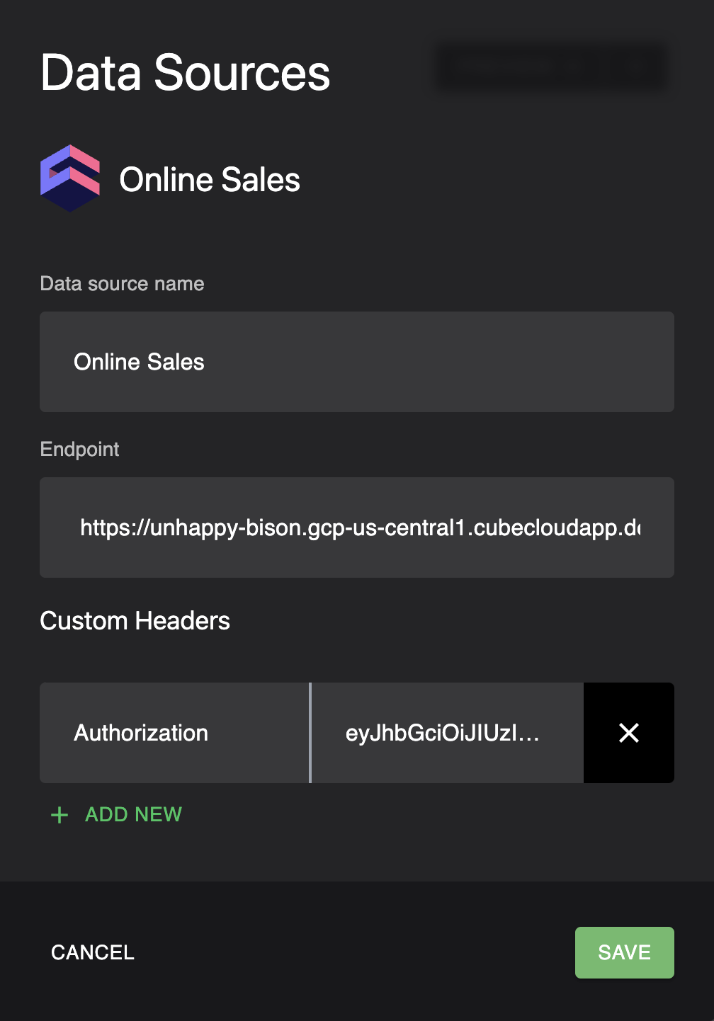
Endpoint URI:
https://unhappy-bison.gcp-us-central1.cubecloudapp.dev/cubejs-api/graphql
Custom Header - Authorization:
eyJhbGciOiJIUzI1NiIsInR5cCI6IkpXVCJ9.eyJpYXQiOjE2NzA0OTM4Mjh9.zKOCWH712tt9flMYKIxAC1FAXx6ryshviDMLnwdr6-A
Executive Dashboard (Page)
The Executive Dashboard has the following components:
Average Order Value (Summary KPI Component)
The average Order Value should be greater than $300, as defined in the outcome while creating the project.
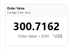
query averageOrderValue  {
  cube(
   limit: 5000
    where: {orders: {createdAt: {inDateRange: ["01-01-2022", "03-31-2022"] } }}
  ) {
    orders {
      avgordervalue
    }
  }
}
Orders in Processing Status (Summary KPI Component)
The number of Orders in processing status should be less than 100, as defined in the outcome while creating the project.
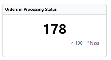
query processingStatus  {
  cube(
    limit: 5000
    where: {orders: {AND: [{createdAt: {inDateRange: ["01-01-2022", "03-31-2022"] }}, {status: {equals: "processing"}}]}}
  ) {
    orders {
      count
    }
  }
}
Order By Status Over Time - Order Status by Month (Line graph Component)
The count of orders in different statuses over a period of time.
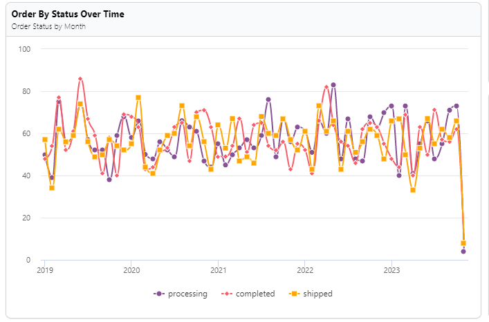
query orderStatuses  {
  cube(limit: 5000) {
    orders(orderBy: {createdAt: asc } ) {
      count
      status
      createdAt {
        month
      }
    }
  }
}
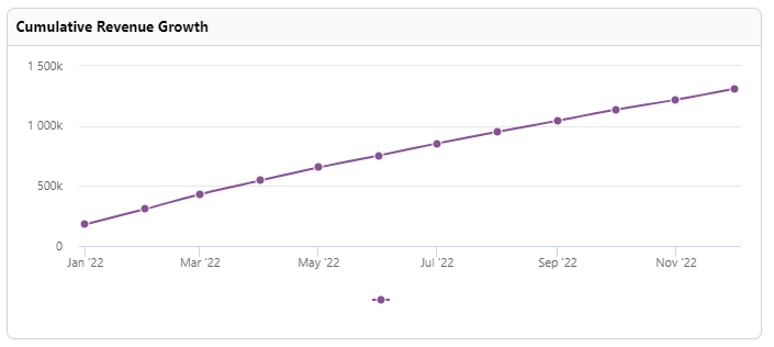
Cumulative Revenue Growth - by Month (Line graph Component)
The cumulative revenue growth over a period of time using a line graph.
query revenueGrowth  {
  cube(limit: 5000, where: {lineItems: {createdAt: {inDateRange: "Last year" } }}) {
    lineItems(orderBy: {createdAt: asc}) {
      cumulativeTotalRevenue
      createdAt {
        month
      }
    }
  }
}
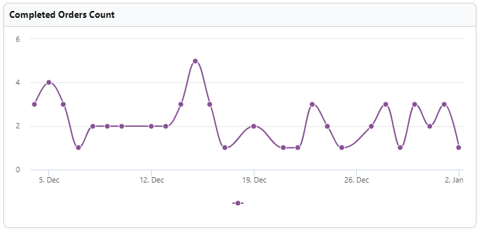
Completed Orders Count (Line Graph component)
The count of orders completed on a day over a period of time
query CubeQuery  {
  cube(
    limit: 5000
    where: {orders: {status: {equals: "completed" } , completedAt: {inDateRange: "Last 30 days"}}}
  ) {
    orders(orderBy: {completedAt: asc}) {
      count
      completedAt {
        day
      }
    }
  }
}
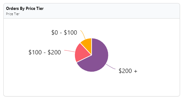
Orders By Price Tier (Pie Chart Component)
The orders are segregated into three buckets of range $0-$100, $100-$200, and $300+. The query will return the number of orders in the price tier.
query CubeQuery  {
  cube(limit: 5000) {
    orders(orderBy: {count: desc}) {
      count
      amountTier
    }
  }
}
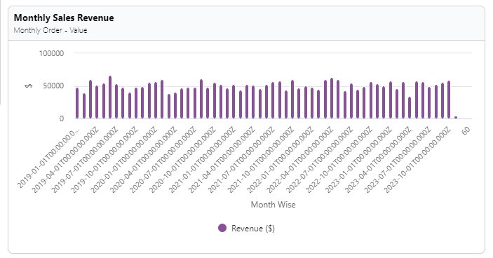
Monthly Sales Revenue (Column Chart Component)
The total sales on a monthly basis/given range.
query salesRevenue  {
  cube(limit: 5000) {
    orders(orderBy: {createdAt: asc } ) {
      totalAmount
      createdAt {
        month
      }
    }
  }
}
Date Range Picker
Date range pickers allow your customers to filter the dashboard by a date range. This ensures that customers only view the data they need to and don't get overwhelmed with too much information. Date range pickers can also zoom in on specific periods, allowing your customers to make more informed decisions. In addition, with a date range picker, you'll have more control over what data is displayed.
Level Up!
Implement the Date Range Picker and connect to all the widgets above.
Updated about 1 year ago