
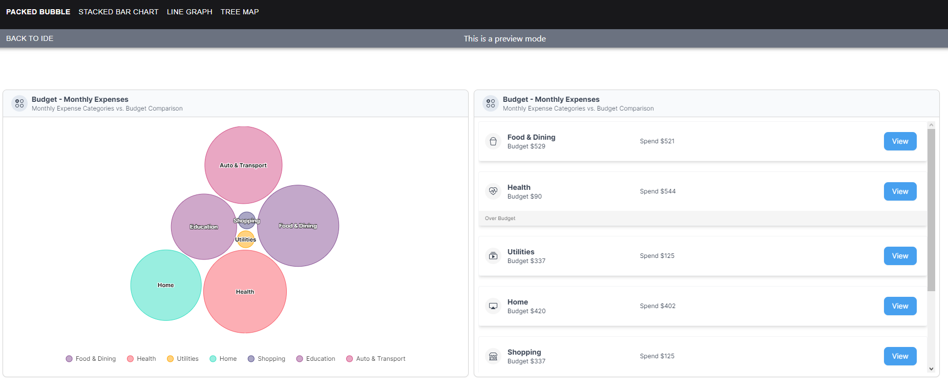
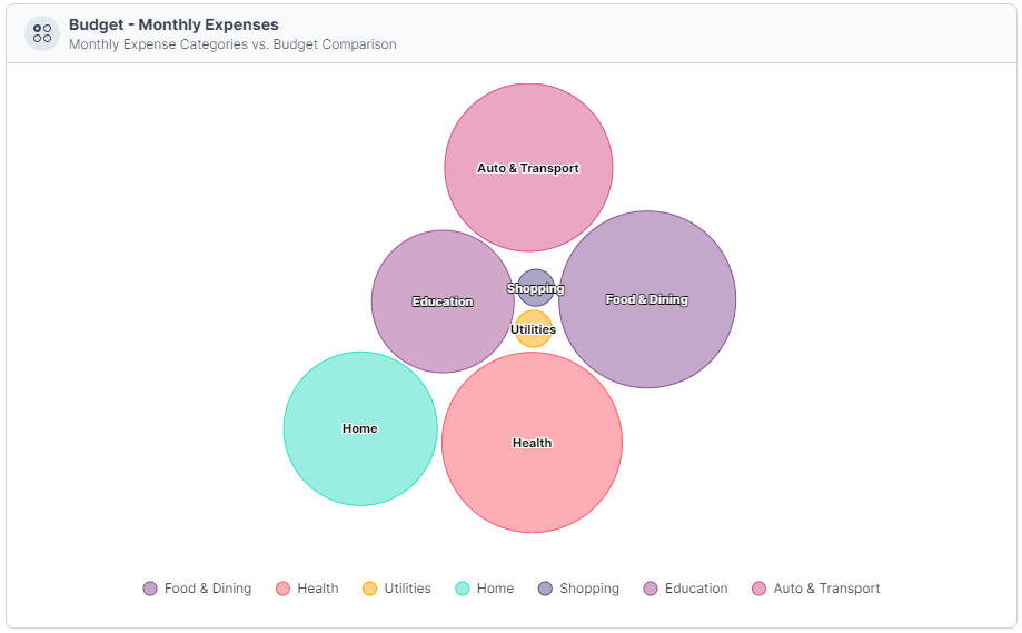
Packed Bubble
In this section, we will guide you through the step-by-step process of setting up and customizing Packed Bubble Charts to effectively visualize your data.
The Packed Bubble Chart is a powerful visualization tool that's particularly useful for showcasing hierarchical or nested data. It displays categories and subcategories as circular bubbles, with their size representing the proportion of each category within the whole.
- Represents hierarchical or nested data using clustered circular bubbles.
- Each bubble represents a category, with its size reflecting its proportion within the whole.
- Bubbles are organized hierarchically, with main bubbles and nested subcategories.
1. View
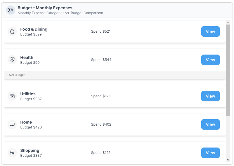
The 'View' section showcases the final output of our data visualizations. This is where you'll see the charts and graphs that provide a clear and visual representation of your data. These visualizations are the result of the setup and customization steps we'll walk you through in the following sections.
2. Data Structure
The 'Data Structure' section presents the raw data that serves as the foundation for our visualizations. It's essential to have well-structured data to create meaningful and accurate charts. In this section, we've organized the data into categories, each with corresponding 'amount' and 'budget' values. This data will be used to populate the charts we'll build.
{
  "categories": [
    {
      "name": "Food & Dining",
      "amount": 521,
      "budget": 529
    },
    {
      "name": "Health",
      "amount": 544,
      "budget": 90
    },
    {
      "name": "Utilities",
      "amount": 125,
      "budget": 337
    },
    {
      "name": "Home",
      "amount": 402,
      "budget": 420
    },
    {
      "name": "Shopping",
      "amount": 125,
      "budget": 337
    },
    {
      "name": "Education",
      "amount": 350,
      "budget": 515
    },
    {
      "name": "Auto & Transport",
      "amount": 472,
      "budget": 508
    }
  ]
}
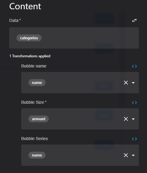
3. Setup
The 'Setup' section is where we get hands-on with the process of creating our visualizations. To bring your data to life, there are key elements that need to be configured and customized. Here's what you'll be setting up:
- Data: You'll start by specifying the data source, which in this case is the structured dataset we provided in the 'Data Structure' section. This data will be the foundation of your visualizations.
- Bubble Name: To give context to the elements in your visualizations, you'll determine the 'bubble name.' This is the label or title assigned to each element, usually derived from the 'name' attribute in your data.
- Bubble Size: The 'bubble size' is crucial for representing the proportion of each element within the whole. You'll configure this attribute to accurately scale the size of each element in your visualizations, typically based on the 'amount' attribute.
- Bubble Series: For some visualization types, you may want to group or categorize the bubbles. 'Bubble series' is where you'll define these groupings, helping you convey relationships and hierarchies within your data.
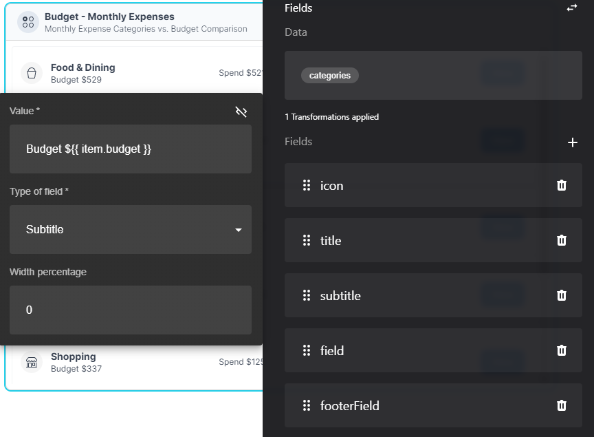
4. Same Data Structure for FlexList
In the 'Same Data Structure for FlexList' section, we continue to leverage the same data structure introduced earlier. However, the fields used for the FlexList are distinct and tailored to this specific format. While the categories and hierarchical relationships remain consistent, we'll adapt the data to suit the requirements of a FlexList, highlighting different aspects of the data and organization. You'll discover how to structure and set up the data to create an effective and informative FlexList presentation."
Updated about 1 year ago