
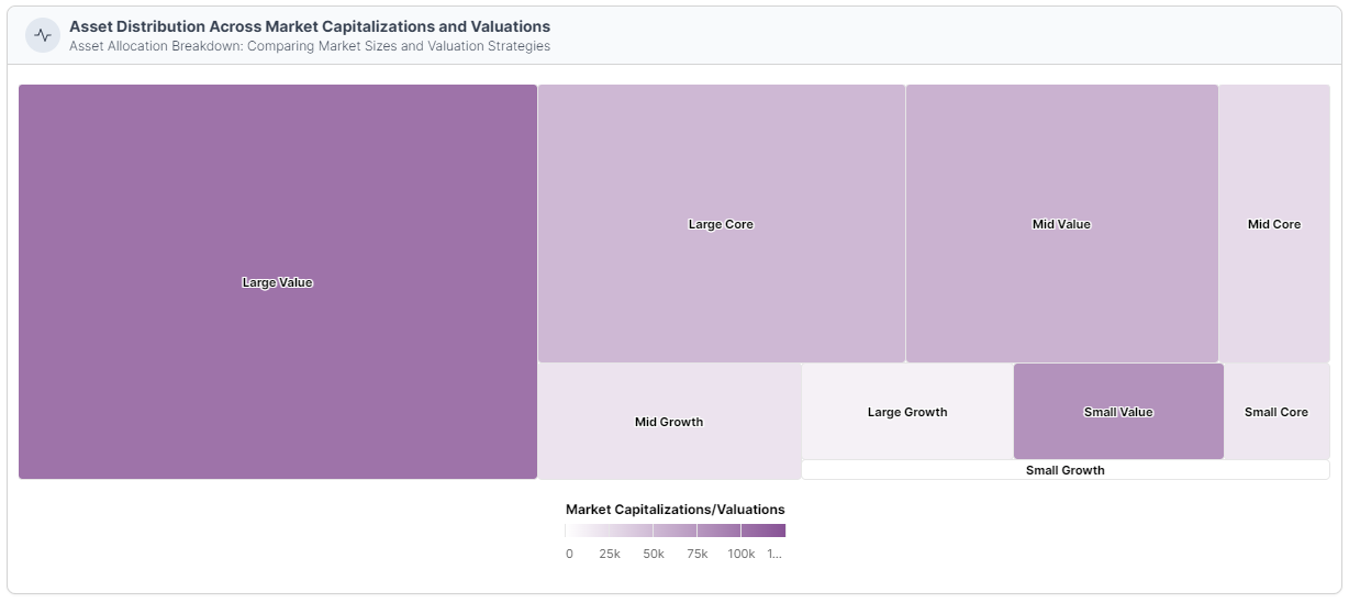
Tree Map
In the upcoming section, we'll guide you through the process of creating Tree Maps and customizing them to display your hierarchical data with clarity and precision.
Tree Maps are an excellent choice for illustrating hierarchical data structures with multiple levels of categories. They present data as nested rectangles, with each rectangle representing a category or data element. The relative sizes of these rectangles show the proportional values of each category.
- Hierarchical chart that visualizes data with nested rectangles.
- Each rectangle represents a category or data element, with relative sizes indicating proportional values.
- Categories are subdivided into subcategories, efficiently displaying the hierarchical data structure.
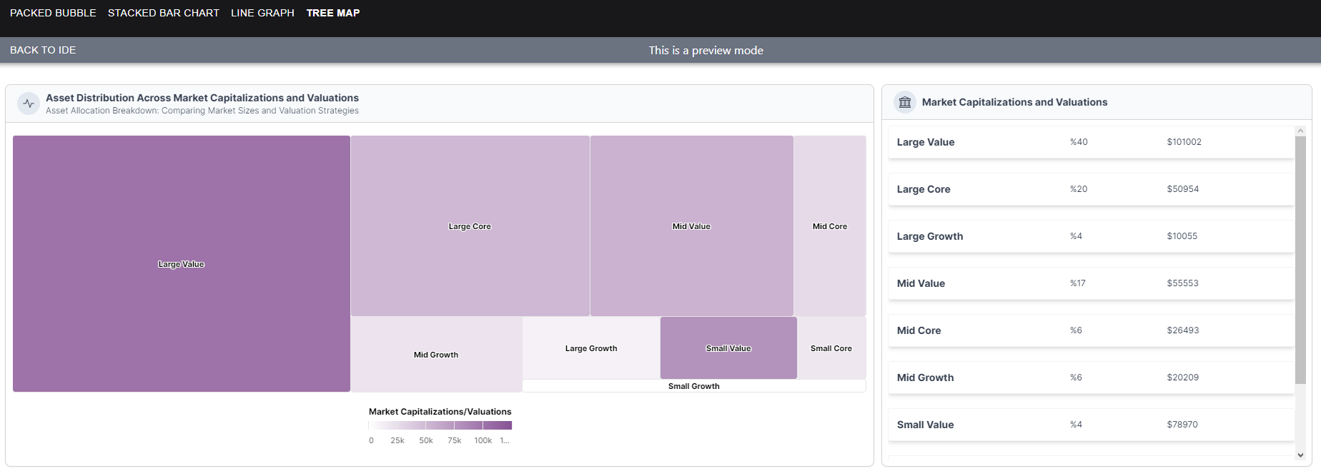
1. View
The 'View' section showcases the final output of our data visualizations. This is where you'll see the charts and graphs that provide a clear and visual representation of your data. These visualizations are the result of the setup and customization steps we'll walk you through in the following sections.
2. Data Structure
The 'Data Structure' section presents the raw data that serves as the foundation for our visualizations. It's essential to have well-structured data to create meaningful and accurate charts. In this section, we've organized the data into categories, each with corresponding 'amount' and 'budget' values. This data will be used to populate the charts we'll build.
[
  {
    "assetType": "Large Value",
    "percentage": 40,
    "value": 101002
  },
  {
    "assetType": "Large Core",
    "percentage": 20,
    "value": 50954
  },
  {
    "assetType": "Large Growth",
    "percentage": 4,
    "value": 10055
  },
  {
    "assetType": "Mid Value",
    "percentage": 17,
    "value": 55553
  },
  {
    "assetType": "Mid Core",
    "percentage": 6,
    "value": 26493
  },
  {
    "assetType": "Mid Growth",
    "percentage": 6,
    "value": 20209
  },
  {
    "assetType": "Small Value",
    "percentage": 4,
    "value": 78970
  },
  {
    "assetType": "Small Core",
    "percentage": 2,
    "value": 17388
  },
  {
    "assetType": "Small Growth",
    "percentage": 2,
    "value": 0
  }
]
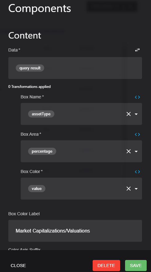
3. Setup
The 'Setup' section is where we get hands-on with the process of creating our visualizations. To bring your data to life, there are key elements that need to be configured and customized. Here's what you'll be setting up:
- Data: You'll start by specifying the data source, which in this case is the structured dataset we provided in the 'Data Structure' section. This data will be the foundation of your visualizations.
- Box Name: The 'box name' refers to the label or title assigned to each rectangle in the Tree Map. Typically, this name corresponds to the 'name' attribute in your dataset.
- Box Area: The 'box area' is essential for determining the size of each rectangle. This size is directly proportional to the attribute you choose, often associated with the 'amount' of data within each category.
- Box Color: You'll also assign specific colors to each rectangle, providing a visual distinction between categories or subcategories within your Tree Map.
4. Same Data Structure for FlexList
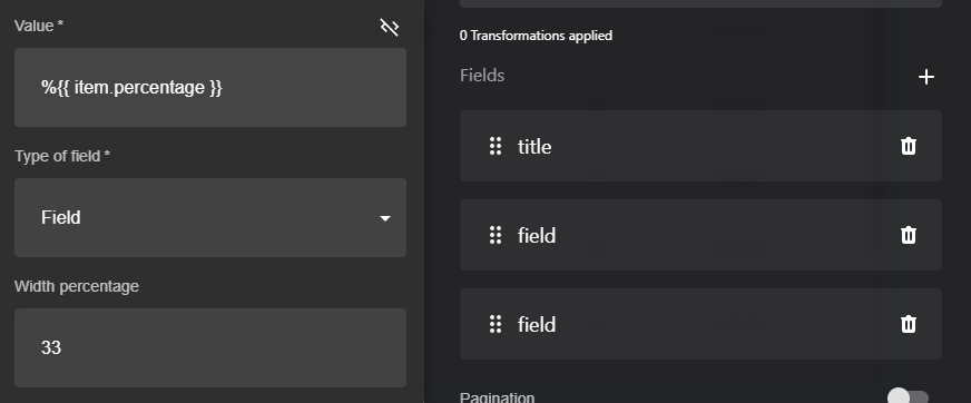
In the 'Same Data Structure for FlexList' section, we continue to leverage the same data structure introduced earlier. However, the fields used for the FlexList are distinct and tailored to this specific format. While the categories and hierarchical relationships remain consistent, we'll adapt the data to suit the requirements of a FlexList, highlighting different aspects of the data and organization. You'll discover how to structure and set up the data to create an effective and informative FlexList presentation."
Updated about 1 year ago